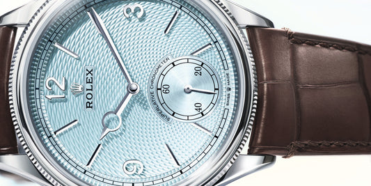
There’s been a huge increase in luxury watch brands experimenting with new dial shades recently, hues that are totally different to what saturated the market ten years ago.
Back then, it felt like 90% of men’s and women’s watches had either black, navy, silver, or mother-of-pearl dials. It was unusual to see anything remotely “colourful.” On the other hand, you can open almost any brand’s website to find an array of displays now.
So where did it all come from?
From memory, around the end of 2018, green watch dials seemed to be the next ‘in thing.’ I particularly remember Breitling launching one of their inaugural Premier B01 Chronograph 42 watches with a Bentley British Racing Green dial. It wasn’t anything overly dramatic with a dark forest-green sunray-brushed center, but it was still a surprising departure from the typical hues of black and blue. Several other brands were also trialing shades of green at this time, from dark khaki greens to slightly brighter emerald hues.
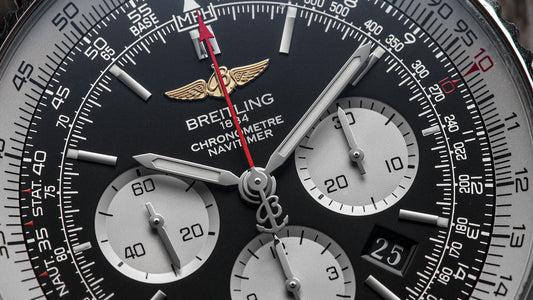
Five years later and green-dialed watches are still reigning supreme. So much so that you have Swiss names like IWC Schaffhausen launching entire collections dedicated to the color. Their newly launched Green Edition collection includes several Pilots and Portugieser models with varying green displays, including a very handsome IWC Pilot’s Mark XX watch. There’s also been some pretty TAG Heuer Carreras sporting their own green centerpieces and several green Breitling Navitimers in the mix. The latter was one of the first models I remember showcased with a more feminine pastel green dial.
Now my next question is: who are these colorful watch dials for?
Myself and Richard (fellow Watch Gecko author) spoke briefly on the subject, and I’m sure he won’t mind me saying that he admitted to being rarely tempted by watch dials colored in anything other than black, blue, or silver. They’re classic for a reason; I get it. I also know many watch-obsessed gentlemen who feel the same way, men who will happily admit to screwing their noses up at the abundance of colorful watch dials on the scene. Then again, I know this will not be the case for everyone because otherwise, why would so many luxury watch brands be launching them?
 Oris Aquis Holstein Purple - Credit WatchGecko
But then it tempts the question: what if brands target women's wrists with these colourful watch dials?
As a female who is insanely bored with the over-done mother-of-pearl dial, I’ll admit that seeing these colourful options on the market has seriously reinvigorated my love of watches. It’s refreshing to see cases of different styles and sizes paired with these brilliantly colored displays.
It’s embarrassing to admit, but when Breitling launched their 40mm Navitimer with a choice of a mint green or pastel blue dial, I instinctively assumed that these watches were reserved exclusively for men at this size. After realising that any watch is a women’s watch if a woman is wearing it has since made me question whether Breitling created this sports watch with women in mind. We know many women are choosing to wear larger watches nowadays, so what’s to say that Breitling didn’t plan this all along?
Of course, it’s not just pastel blues and mint greens anymore. We’ve got an increasing number of dial colours in pink, red, purple, lime green, and orange available in watch cases suited to both men and women.
The aubergine-coloured Oris Aquis 2023 Hölstein Edition is a brilliant example of this.
 Oris Aquis Hölstein Edition - Credit WatchGecko
Every year, on June 1st, Oris launches a limited edition watch named after the Swiss village where Oris originates from. This fourth Hölstein Edition is very different to any done before, combining the specs of their 43.5mm Aquis Diver’s watch with a rich purple gradient dial. For many, the dial here will be a big surprise as it’s a shade we’ve never seen Oris do before. It’s a fun colour, and that seems to be what Oris is going for. The case back is printed with an illustration of the Oris Bear diving in his scuba gear. In the press release, to explain why the bear appears, Oris simply says: “Because why not. It’s fun, and it made us smile.” I don’t disagree; it made me smile too, and isn’t that exactly what you want from a timepiece?
 Oris Aquis Hölstein Edition - Credit WatchGecko
Another very colourful watch launched recently is the Zenith Chronomaster Original Pink “Unique Piece for Susan G. Komen”
 Zenith Chronomaster Original Pink - Credit Zenith
When I first saw the initial images of this watch, I wanted to rip into it completely. I genuinely thought it was a Michael Kors watch at first; I don’t know whether it’s the placement of the diamonds on the lugs or the shade of hot pink used on the dial. This colour just isn’t for me. Don’t get me wrong, I actually love a pink-dialed watch, but this bright pink shade is better suited to the wrist of Margot Robbie in the new Barbie film or Reece Witherspoon in Legally Blonde. Truthfully though, the diamonds on the lugs ruin this watch. I really don’t know what they were thinking.
 Zenith Chronomaster Original Pink - Credit Zenith
The watch has been launched for a fantastic cause, with 100% of the proceeds going to Susan G. Komen, the world’s leading breast cancer organization. If it was me, though, I’d donate the retail price directly to the charity to avoid having to wear the watch.
Lastly, I want to talk about the freshly-released Omega Aqua Terra Chronometer watches with pastel-coloured dials. For me, this is doing colourful watch dials right.
The shades here are really nice; they’re bold enough to be different but still elegantly muted that they don’t feel tacky. The dials currently come in a pastel pink, muted aubergine, teal green, navy blue, and champagne. The first three are my favorites, and I have to celebrate that these are 34mm watches, clearly aimed at women, with no diamond decoration. They’re also chronometer-certified and have exhibition case backs, so double win. I’d be interested to see if Omega utilises these colors later within the 38mm Aqua Terra models, too; that would certainly make me very tempted.
So, after all of this, where do you stand on the current trend for colourful watch dials?
I’d be really interested to know. Do you prefer the classic black, blue, and silver palette, or are you enjoying these more experimental colours? And who do you think watch brands are targeting with these displays? Are you a man who would buy a pastel watch dial?


